When it comes to game development sooner or later you will have to think about the thing most people see when they launch a game – the main menu.
When it comes to “High Stakes” I do wanted to achieve three things
- obtain the oldschool menu look and feel from NFS1, NFS2, NFS3 and NFS4
- transfer the oldschool look and feel to a new experience
- add visually nice effects that give an immersive experience
So, in first place, I took a deeper look to all menus of these four games and compared them.
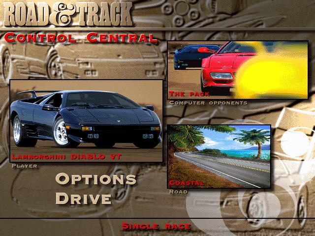
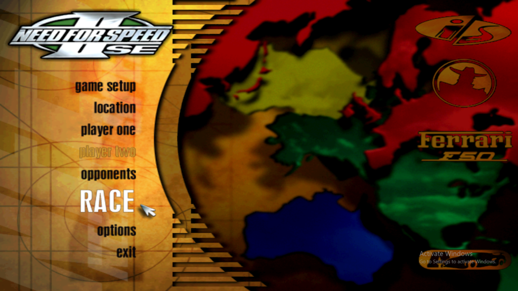
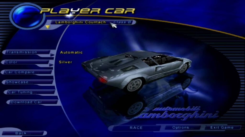
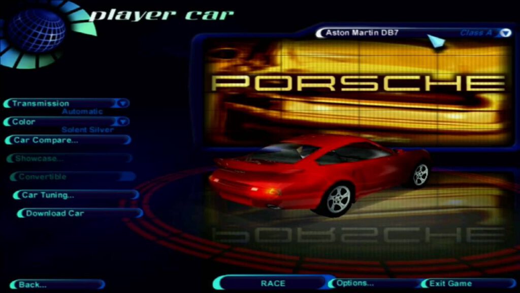
As you will see some don’t have anything in common and some differences couldn’t be bigger, I took a note on every single element I really liked about the menu from each game, alsways keeping the usability in mind, e.g. that I do not want to force users to need to use mouse input to browse through the menus.
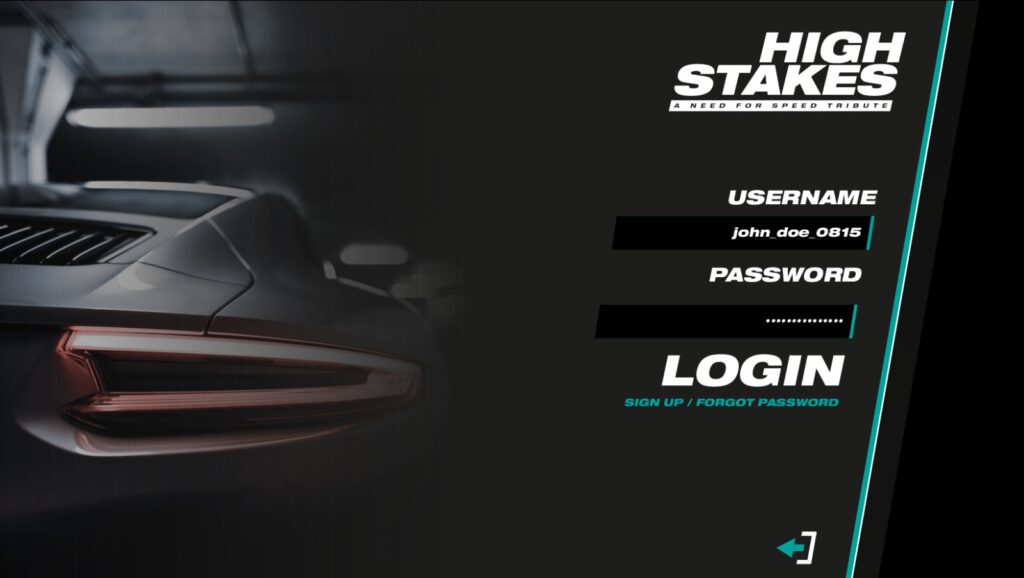
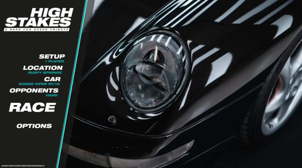
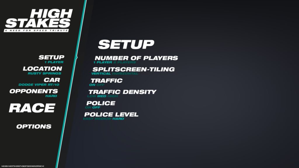
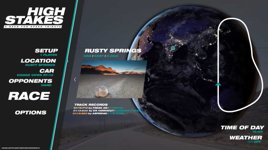
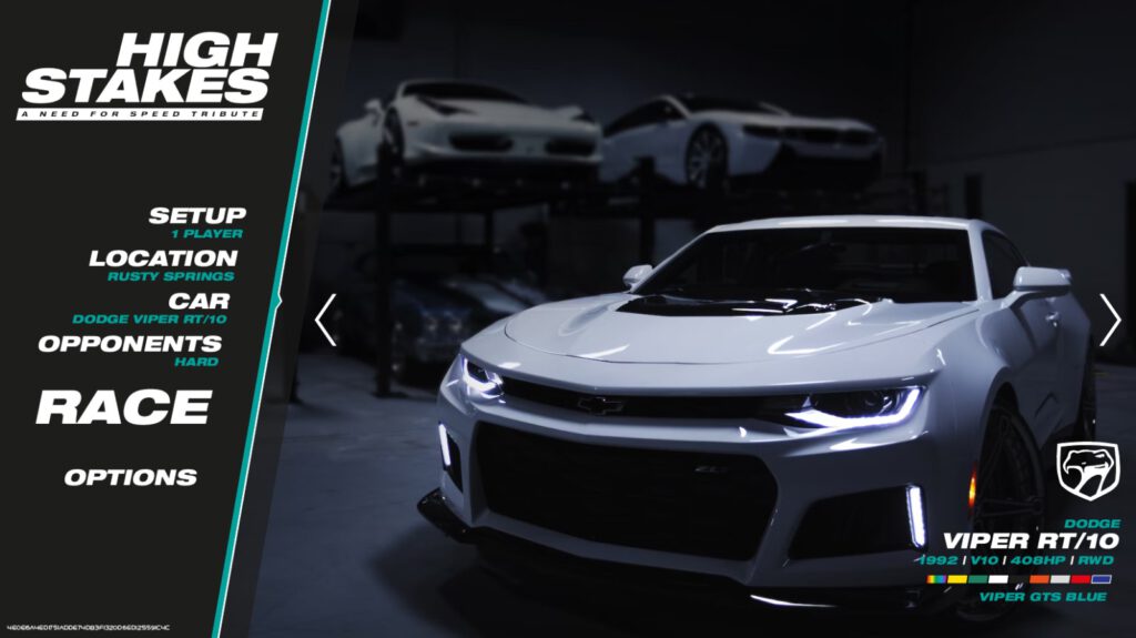
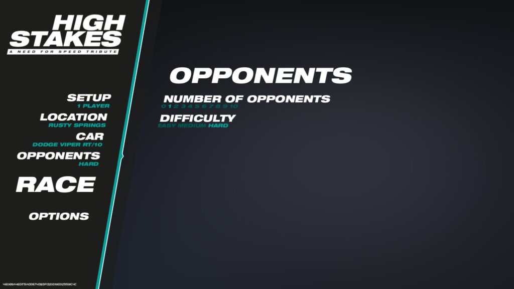
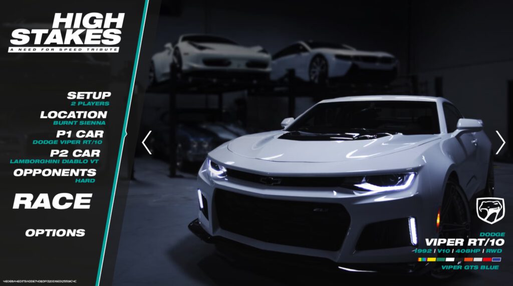
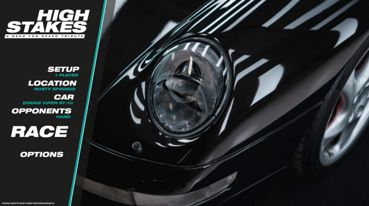
The following screenshots are work-in-progress state of the current main menu of High Stakes – resembling a mix of all nfs1-nfs4 elements and my very own taste.
